Most independent property management companies have a logo. Fewer have a brand. The difference shows up the moment you put the website next to the Google Business Profile next to the last email an owner received next to the sign on the leasing office door, and none of them agree on the name, the color, or the tone. An owner handing over a six-figure asset reads that mismatch as risk before they read a single word of your pitch. Fixing it is cheaper than most companies assume, and it is one of the few marketing projects that pays off on the website, on the street, and in the inbox at the same time.
What consistency is actually worth
The most cited number in this field comes from Lucidpress (now Marq), whose 2019 State of Brand Consistency Report surveyed more than 400 brand and marketing professionals and found that companies presenting their brand consistently across every channel reported revenue gains of up to 33 percent, up from 23 percent in the firm's 2016 edition. That figure is self-reported by marketers, not measured in a controlled trial, so treat it as a directional signal rather than a guarantee: companies disciplined enough to run a consistent brand tend to also be disciplined about the rest of their marketing, and some of that revenue lift belongs to the discipline rather than the logo. What the number does establish, credibly, is that the companies doing this work do not see it as wasted effort.
Property management adds a second reason consistency matters that most industries do not carry. An owner is not buying a product they can return. They are handing a stranger the keys to their largest asset, and the decision gets made almost entirely on signals of competence read from a distance: the website, the reviews, the Google listing, the way the office answers the phone. When the logo on the site does not match the logo on the truck, that is one less signal pointing the same direction, and owners with six-figure assets at stake notice the gap even when they cannot name what bothered them.
Three numbers worth planning around
Up to 33%
Revenue increase companies with consistent cross-channel branding reported to Lucidpress/Marq's 2019 survey of 400-plus marketing professionals
50ms
Time it takes a visitor to form an opinion of a website's visual appeal, per Lindgaard et al.'s 2006 Carleton University study
$300-$50,000
2026 range from a freelance logo to a full agency identity system, spanning what most independent PM companies actually spend
Sources: Lucidpress/Marq, State of Brand Consistency Report, 2019 and 2016 editions; Lindgaard, Fernandes, Dudek & Brown, "Attention web designers: You have 50 milliseconds to make a good first impression!", Behaviour & Information Technology, 2006; ManyPixels and WeAreTenet 2026 logo and branding cost guides.
The first ten seconds decide whether an owner picks up the phone
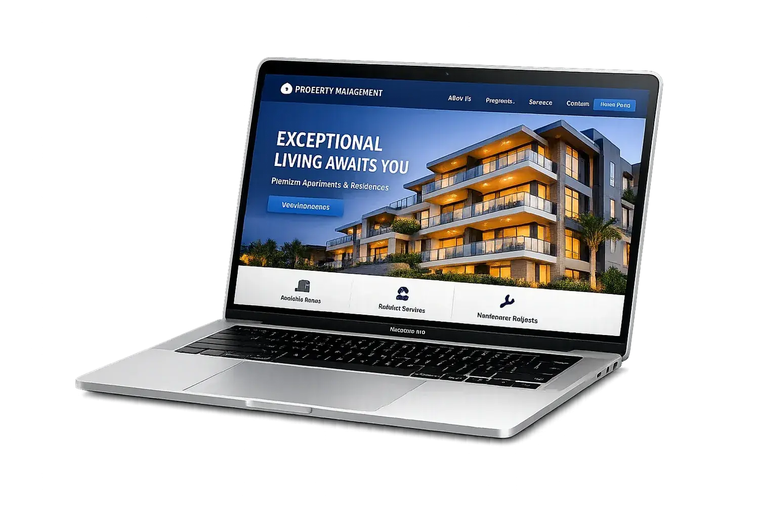
The Lindgaard study is worth reading correctly instead of the way it usually gets paraphrased. Researchers showed participants website homepages for as little as 50 milliseconds and asked them to rate visual appeal. Ratings from the 50-millisecond exposure correlated closely with ratings from a full 500-millisecond look, meaning an opinion of how a page looks forms almost instantly and barely moves after that. The study measured visual appeal specifically, not trust or purchase intent, but for a property management company the two are close cousins: a site that looks assembled from mismatched stock templates and clashing colors reads as unprofessional before an owner reads the fee schedule, and first impressions from an unappealing design are difficult to reverse with copy alone.
That first impression is not carried by the logo alone. It is carried by whether the color that appears in the header also appears in the footer, whether the same typeface shows up on the pricing page as on the homepage, and whether the photography looks like it belongs to one company rather than three different stock libraries. A brand is a small, repeatable set of decisions applied everywhere, and a website is the single place a prospective owner spends the most consecutive seconds looking at those decisions in a row.
Where property management brands actually break
The failures are rarely dramatic. They accumulate through years of small, reasonable-seeming decisions made by different people at different times, none of whom were looking at the whole picture.
The legal name and the operating name drift apart. A company incorporated as "Smith Property Holdings LLC" markets itself as "Smith Realty Group" on the website, "Smith Property Management" on the Google Business Profile, and "Smith Realty" on the sign. None of those are wrong individually, and owners searching for the company by any one of them may land on a listing aggregator or a competitor instead of the real site. The logo file gets exported once for the website launch and never updated again, so a color refresh done for a new brochure two years later never makes it onto the header. Vehicle wraps, yard signs, and uniforms get reordered from whatever vendor is convenient at the time, each one working from whichever logo file someone happened to have saved. Email signatures are set individually by each employee, so the company that looks unified on its homepage sends five visually different emails a day. None of this is anyone's fault specifically. It is what happens when nobody owns the brand as a whole, only the piece in front of them.
Fixing it is not a redesign. It is usually a short, disciplined project: pick the one correct name, one logo file in the right formats, two or three colors, and one typeface pairing, write it down, and replace every outdated version wherever it lives. The cost of that project scales with how much of it you do yourself versus hand off.
| Approach | 2026 cost range | What you actually get | Where it runs out |
|---|---|---|---|
| AI logo generator or DIY tool | $0-$50 | A logo file, sometimes a couple of matching color codes | No usage guidelines and no design system, so the website, the signage and the vehicles are left to guess at consistency independently |
| Logo marketplace or design contest | $249 and up | A finished logo chosen from several submitted concepts | Still only a logo. Color palette, typography and photography direction are decided later, by whoever happens to build the next thing |
| Freelance designer | $300-$2,000 for a logo, $500-$5,000 for a fuller package | Real discovery conversation, a logo, a color palette and type choices suited to the company | Written usage guidelines are often thin, so consistency depends on someone remembering the rules rather than having them documented |
| Branding agency, full identity package | $2,500-$50,000 | Logo, color system, typography, photography direction and written guidelines a whole company can follow | Cost scales past what most independent companies managing a few hundred to a few thousand doors can justify in a single year |
What has to match, specifically
A brand does not need to be elaborate to hold together. It needs a short list of decisions, made once, applied everywhere: the exact legal and operating name and when each is used, one logo file exported in the formats every vendor will ask for (vector for print, transparent PNG for the web, a square version for social and app icons), two or three colors with their hex codes written down, one heading typeface and one body typeface, and a rough description of the photography style the company uses on its own site and listings. For a management company that carries a NARPM CRMC (Certified Residential Management Company) designation, that credential belongs in the same document, since it is a trust signal that should appear consistently rather than only where someone remembers to add it.
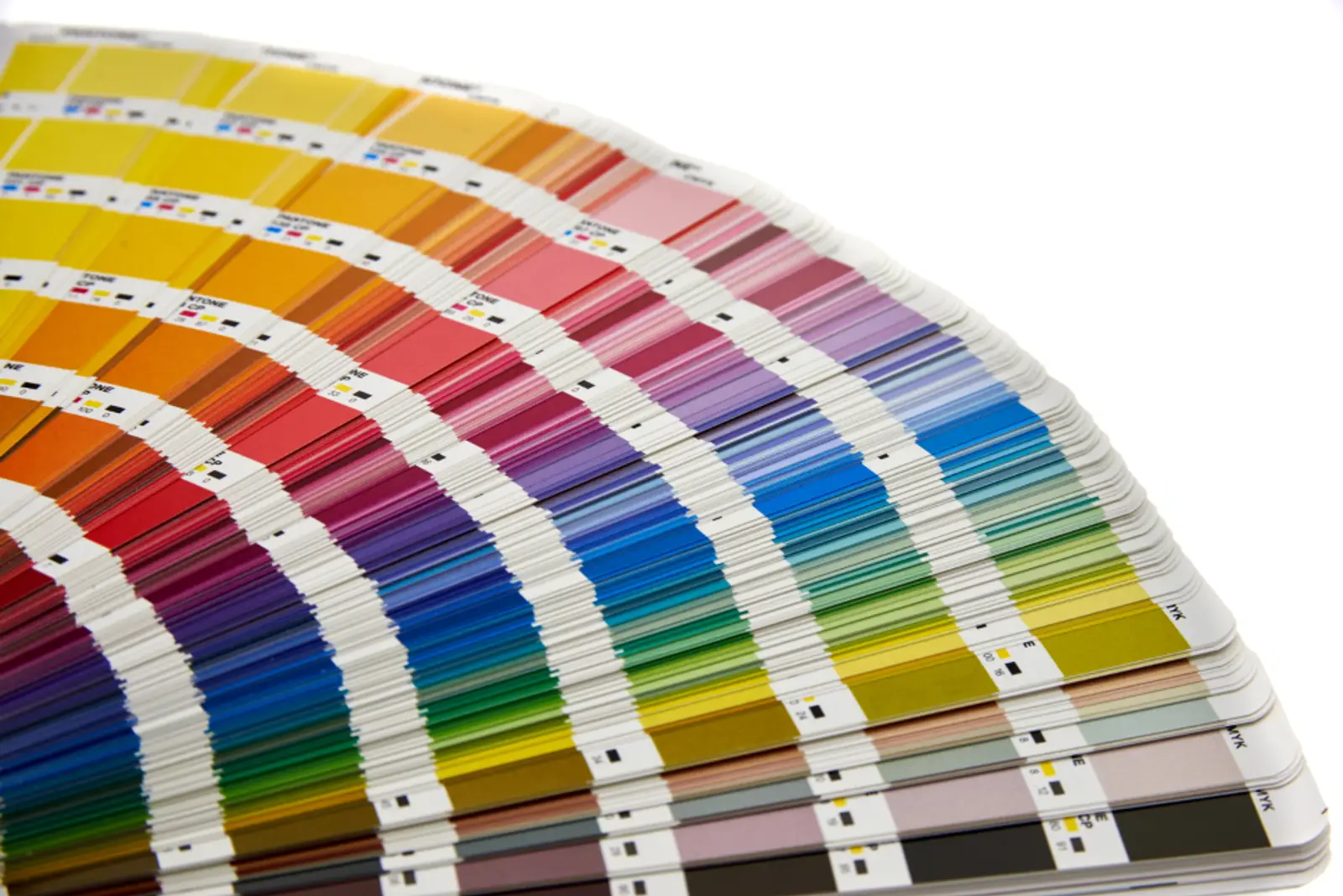
The website is the best place to enforce all of it, because unlike a vehicle wrap or a printed sign, a website's colors and fonts live in code as variables rather than as guesses redrawn from memory. Set the two or three brand colors and the two typefaces as design tokens once, reference them everywhere on the site, and every new page inherits the same brand automatically instead of drifting the way an email signature or a reprinted sign does.
Seven steps to a brand that holds together
Write down the one correct name
Legal name, operating name if different, and when each gets used (contracts and leases versus marketing). Put both in the footer of the website so a search for either one finds you.
Collect every version of the logo currently in use
Pull the file from the website, the Google Business Profile, the last vehicle wrap order, the sign shop, and any employee's email signature. Lay them side by side. The gaps become obvious fast.
Pick one logo file and export it properly
A vector master (SVG or AI), a transparent PNG for web and documents, and a square icon version for social profiles and app icons. One source file, several exports, not several different files.
Lock two or three colors and two typefaces
Write the hex codes down. Set them as CSS variables or design tokens on the website so every page pulls from the same source instead of a developer eyeballing a shade from an old screenshot.
Replace the outdated versions everywhere they live
The Google Business Profile logo, the email signature template distributed to staff, the next sign and vehicle order, and any old brochure still being reprinted. This is the step most companies skip because none of it lives on the website.
Write a one-page guideline, not a fifty-page manual
Name, logo files and when to use each, colors with hex codes, fonts, and one sentence on photography style. Short enough that a new hire or a sign vendor actually reads it.
Give someone ownership of it
Brand consistency degrades the moment it belongs to nobody in particular. One person, even part-time, who reviews new materials against the one-page guideline before they go out keeps the drift from starting again.
The bottom line
A brand is not a logo. It is a short list of decisions, made once and applied everywhere, that lets a stranger recognize your company and trust it faster than a competitor's. Companies that keep that list consistent report meaningfully better revenue outcomes, an owner forms an opinion of your professionalism within 50 milliseconds of your homepage loading, and the fix costs far less than a redesign: one correct name, one logo file, a handful of locked colors and fonts, and someone who owns keeping it that way. Start on the website, because it is the one place the brand's colors, type and photography are all visible at once, and every other touchpoint can be brought in line with it from there.